by Britany McCarty
In Advanced Professional Practices students spend a full year working on a single project to show off all their strengths and interests. Britany brought in her love for soccer and branding to create this forward thinking approach to sports branding.
Problem
Many soccer teams approach branding by looking to the past. This makes for bland logos that can’t compete with current design aesthetics.
Solution
Create a brand identity that ignites a new wave of women’s soccer. It needs to push the boundaries of the current style in the National Women’s Soccer League and develop a future for branding in the league.
The Project
To start the process of creating this brand, Britany needed to develop a team name. After researching Las Vegas attractions and interviewing people from Las Vegas to learn more about the city, she landed on the name Las Vegas Stakes.
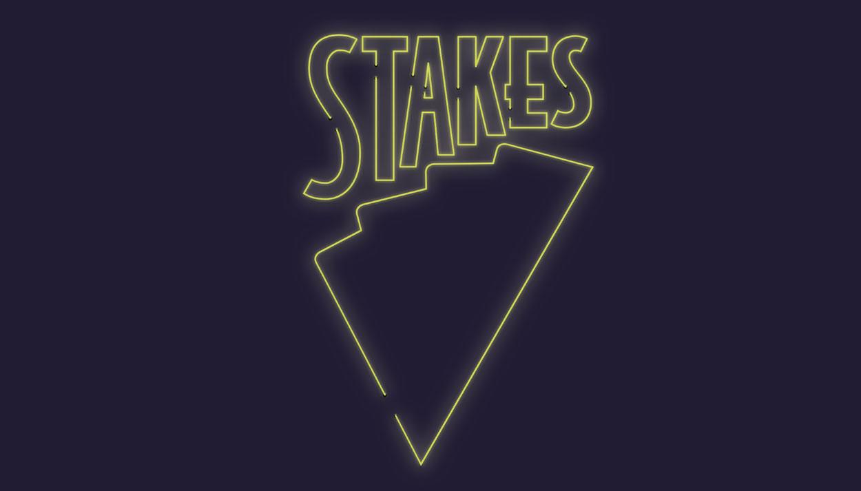
The official logo for the Las Vegas Stakes was inspired by the Las Vegas culture and the team’s launch into the league. Britany established the first two brand colors with the logo - bright blue and dark blue. The bright blue shape is inspired by four playing cards being fanned out, symbolizing the four suits found in playing cards. The point at the bottom is representative of a stake being driven into the ground. The name is placed above the shape acting as a metaphor of the high stakes found in Las Vegas.
Following the development of the official logo and the design assets, Britany then developed three different jerseys for home games, away games, and an alternative option.
Following the jerseys, the warmup jacket, warmup pants, and fan scarf were created. The warmups and fan scarf connected back to the home jersey to symbolize the community of Las Vegas and allow the players and fans to have a piece of home, away from home.
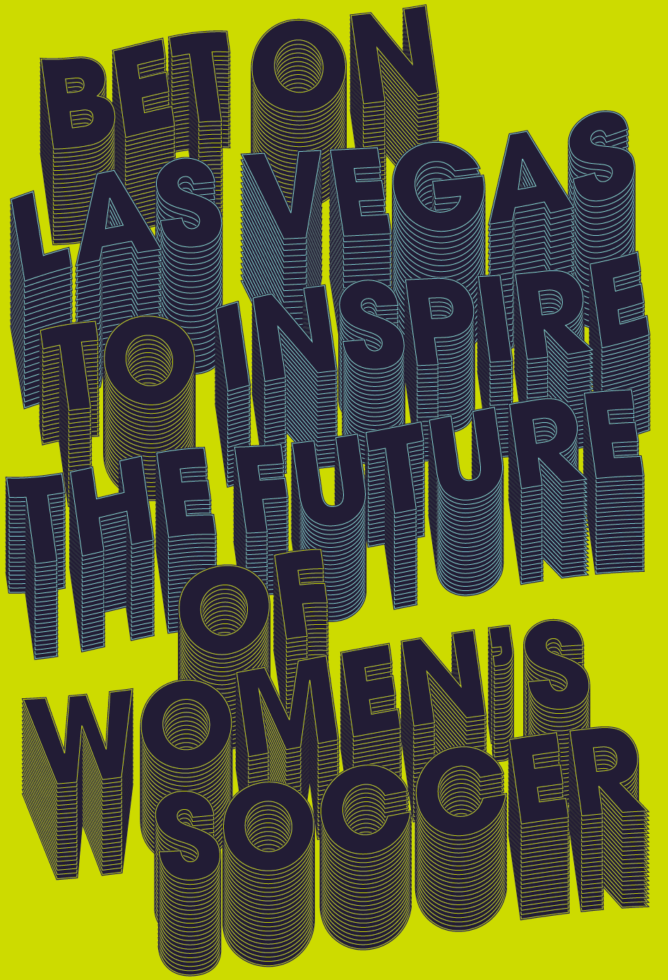
To show how the branding can be used within a printed form, Britany developed five posters that tell the story of the origins of the brand. In three of the posters, she focused on the neon elements of the branding. The remaining two posters focused on integrating a typographic style.
To expand the brand and connect with fans, she created many examples of how social media would look. This included a profile for the team and many individual posts.
All of this was brought into one document that could clearly establish the branding of the team and the design standards for how the brand identity should be represented. Within these brand guidelines all of the colors, typefaces, and applications are laid out so the next designer can pick right up where this project leaves off.
As a celebration of the team and the end of the project, Britany created a hype video. Combining the design elements of the brand and the mission of the team, the hype video works as an introduction to the team and developed system.
Image Gallery


